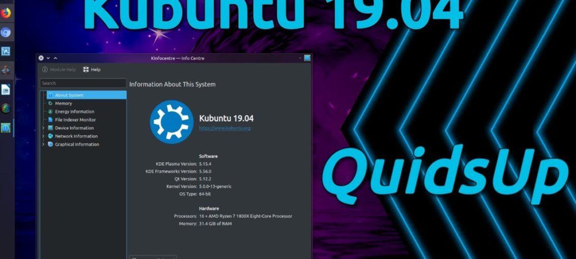
We embark on another test, another distro, another review. This time around, we shall glimpse, sample, taste, torture, and examine Kubuntu, the KDE-flavored of them distros of the current spring crop, and it ought to be an interesting exercise. Plasma Cosmic was good, fairly so, bringing back some of the zest [sic] and fire that we saw with Zesty back in the day.
As you know, I’m driving daily with Beaver on my Slimbook, so I’m always very keen on improvements in the Plasma space, as I cast me gaze to the future and wonder how and when and if I’ll ever be able to fully and unreservedly embrace Linux for home use. Until that day, I paddle up the distro creek, in pursuit after happiness and high-quality software. Perchance Disco shall deliver. Or will it be deliverance? Let’s see.

Live session
I downloaded and etched the Kubuntu ISO, and then let it boot on my G50 laptop. Like Xubuntu, there was a single naughty line of text before a proper graphic splash. At the very least, the two brethren are consistent, and while I don’t like spurious text console vomit, I like the lack of consistent behavior even less. So this is sort of good.
Kubuntu 19.04 is very pretty, very slick – and very much like the last half a dozen Plasma entries, which come with solid, incremental improvements. The Plasma stack stands at version 5.15, and it’s a good, solid one, full of excellent features all around. Mouse actions – double click, and you get a Show desktop button, but this one actually scatters windows to the four corners of the world, or rather your monitor, rather than truly minimize all windows (that’s a separate widget, and we’ll get it later).

One of my readers pointed out that Spectacle no longer offers the big shadow effect, and I was jubilant over this, but testing here, you still get the shadows it seems. Shame, because Spectacle is a really nice tool, and the extra embellishment ruins its effectiveness. Save as is the default action.
Network connectivity
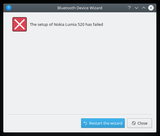
No double prompt for Wireless password bug anymore, so this is good. Bluetooth pairing supposedly failed, but it actually didn’t, everything was fine. More consistency when it comes to bugs. Samba sharing wasn’t possible, as samba-common isn’t installed, and you may need the sharing protocol tweak, but after that I had really good and fast Samba throughput. Alas, no Samba printing was available. All in all, this is fairly lukewarm.

Multimedia support
Both HD video and MP3 playback worked fine, no issues. I did notice no VLC icon, and this felt strange, and it turns out, it was hidden by default for some reason. I’ve always liked the music integration in the system area, and I’m not sure why it’s not shown. You can control multiple players at once, and if you install the browser integration add-on, you’ll also see your browser streams in the system area, like Youtube clips, but without cover art, thumbnail previews or actual playback – in the system area that is.


Smartphone connectivity
Getting the Aquaris phone to show its contents took a few seconds – like Xubuntu. I tried another Android phone, my Moto G6, and things have improved some since I tried it first in Plasma. Well, I tried in 18.04 on my Slimbook, and I had connectivity issues. It works better now, and KDE Connect gave me no grief, but you do need to give the right permissions for the laptop to control the phone.


The phone remembers the Slimbook, so it’s showing here, too. Nice.


The Moto hiccuped showing right away, but the second time around I plugged it, it was all right. Plasma still lags some after Gnome-based systems when it comes to simple USB connectivity for smartphones. Windows Phone behaved well.


Installation
More consistency if not brilliant results. A long wait to get the partitions scanned, and then your language will be set to the timezone you select and not matched to your keyboard. The partitions had no labels, so I had to guess where to install Kubuntu, and the slides come with an older format, with a font type that doesn’t match the installation wizard. More can be done here, for sure. But it worked well, and soon I had Disco available for more testing.


Disco Disco, good good
After the installation, the Wireless configuration was not preserved, I had to do it again, plus we have a divergence from the Xubuntu experience. I also had to install Samba, so more hassle, and we still don’t get correct timestamps on copy! But I was in a fairly good mood, because overall, things were looking quite reasonable for now.

Package management & updates
Solid. Discover is getting constantly better. There wasn’t much to do, but I had the update prompt right away, and there were no issues. If you want to configure the additional drivers or alike, Kubuntu uses the older management facility (allows you to tweak sources, too), and not like the new one we saw in Xubuntu Dingo.


The window label is misleading, I think; older design, too. Not as pretty or integrated as it should be.
Applications
The distro image weighs more or less the same as the Xubuntu one. The arsenal is similar yet different. You get Firefox, KMail (Thunderbird is a better option), VLC, LibreOffice, Okular, GwenView, and then some. I did install a few extras, the usual GIMP, Steam, Skype, Chrome combo. Rounded and practical.

Resource usage, performance
Disco is very lean. On-idle memory usage is just about 400 MB, and the CPU ticks at less than 1%. Not surprisingly, you get excellent responsiveness. The desktop is quick, nimble, and the application windows launch and open almost instantly. With each new release, Plasma shows it’s possible to squeeze extra fine juice from the system.

Battery life
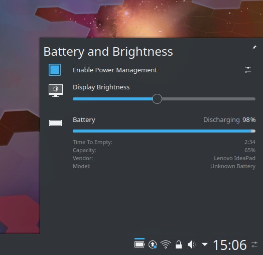
The numbers read 2.5 hours at 50% brightness and light to moderate usage, with the cell capacity at two thirds the original charge. This translates from 150 minutes into about four hours, which is pretty good but not as phenomenal as I’d like to see. Good, very good in fact but not the best we’ve seen here.
Hardware compatibility
Super-fast wake from sleep, it’s unbelievable. The hardware worked beautifully, without any issues. All the Fn buttons behaved, the webcam behaved, all of it. Very good. I like.
Various visual and functional improvements
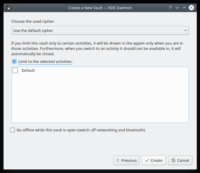
Lots of nice little touches everywhere. Firefox downloads are now shown in the notification area, and you also get a live icon overlay (similar to the Dolphin copy progress), including the actual count of active downloads. Vault has also been significantly improved. In one of my Slimbook combat reports, I complained that managing Vault & private desktop activities was cumbersome. Now it seems there’s better separation, and you can turn network off for certain Vaults. Very cool and practical.

Customization
Getting everything in order and pretty was a simple and enjoyable affair. Plasma 5.15 comes with many noticeable, tangible improvements on the UI side, too. It might be a placebo effect, but the fonts were ever so slightly darker and crisper I didn’t feel the immediate need to go full HEX 000000 on them. The greeter comes with nicer symbolic icons for actions (like suspend, or hibernate where available). Browser integration works really well.


The keyboard indicator, Caps Lock thingie (wax on, wax off) is also much nicer than before.

Small problems
Well, apart from the naughty things I’ve mentioned so far, that is. One thing that annoyed me was getting the shortcuts in the sidebar inside Dolphin all sorted. The hard-coded ones refused to move, and so I spent a good few minutes trying to drag ‘n’ drop other folders around them. In the end, I had them hidden, and then manually re-added the same ones, only these new icons could actually be easily moved and repositioned. Not sure what happened there.
Final looks
In the end, I had a very nice, smooth Plasma desktop, with the latest from KDE, kernel 5.0, and really sweet looks. In a way, the experience reminded me of my Zapus review, which turned out to be one of the freshest, most exciting Linux distributions in the past few years, and the one release that decided Plasma for me. I’m glad some of that aroma is present here, too.
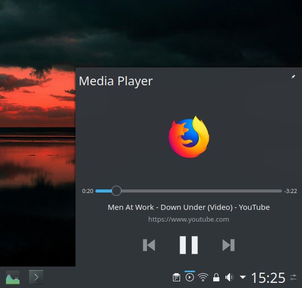
Playing the Australian national anthem, because.


Conclusion
Kubuntu 19.04 Disco Dingo is a pretty solid distribution. It does have some rough edges and some glaring problems, like the Samba connectivity, the hiccup or three with the smartphones, the language localization, and the Dolphin icon thingie. But then, it also brings in a whole basket of nice polishes, improvements and fresh, original features, which balance out the rough patches.
Best of all, the ugly stuff can be tweaked and sorted out, which begs the question why did the distro ship with these by default? It wouldn’t take much to spit-polish everything to perfection. Anyway, Plasma remains pretty and smart and slick, the system is fast and responsive and stable, you get a good bundle of programs, and it’s a genuine enjoyment using this distribution. Given the fact 19.04 is a test bed of sorts, much like Zesty was, the level of fun is surprisingly high. But it does make me happy. Once again, I’m cautiously hopeful and optimistic, but even more so than I was with Cosmic. 8.5/10, so better prep them thumb drives for an adventure.